navigate_before
navigate_next
arrow_back

Aaron Zinou Logo

Aaron Zinou Logo

This was a very exciting project. Aaron is an established personal trainer with a strong background as a police officer and martial artist, who has high standards for training and nutrition. The task here is to express his training quality and strong personality in a logo, with the main focus being on him as the brand.

I divided the logo into three sections to cover all important aspects and requirements for representing Aaron’s brand.

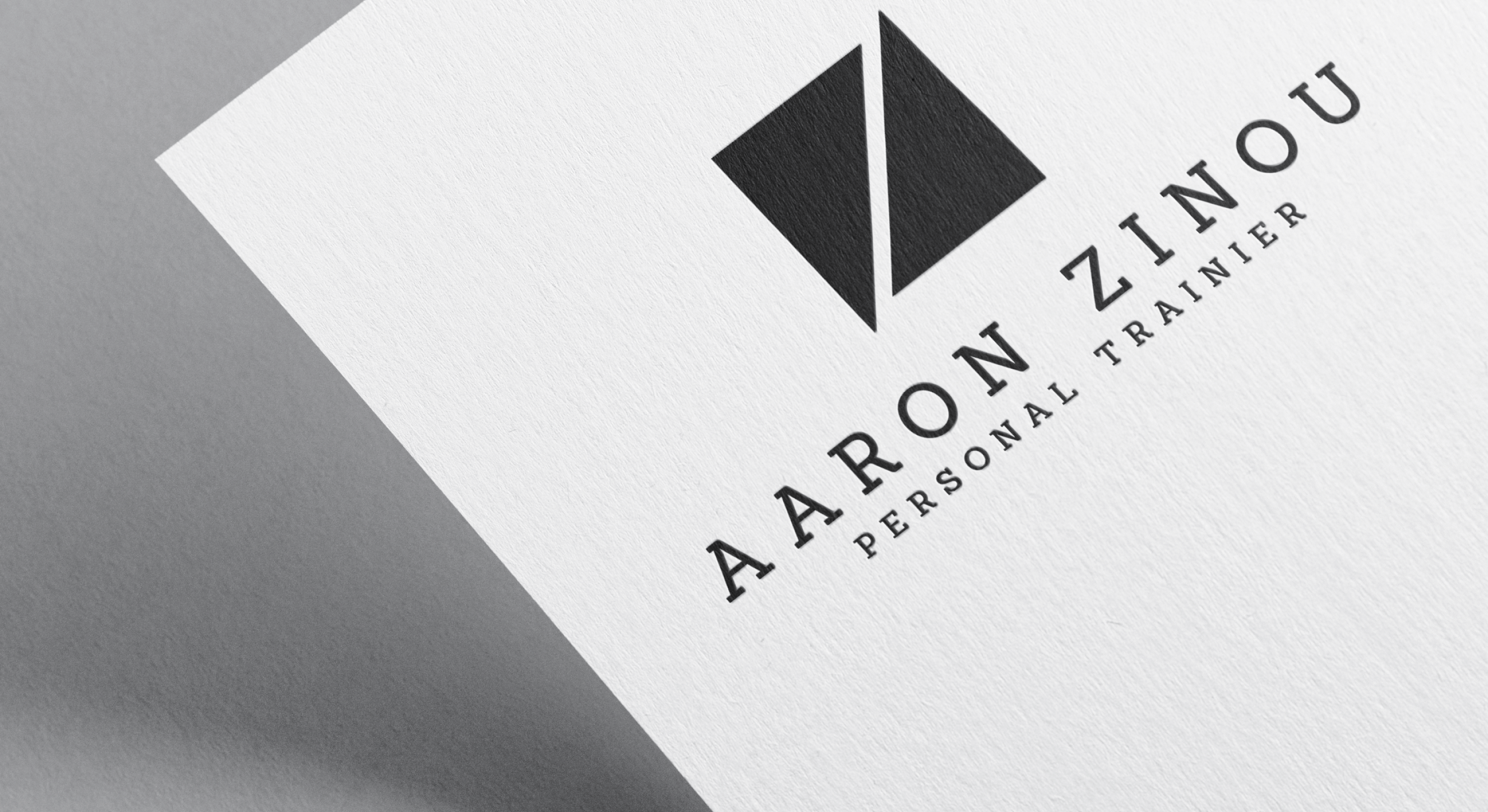
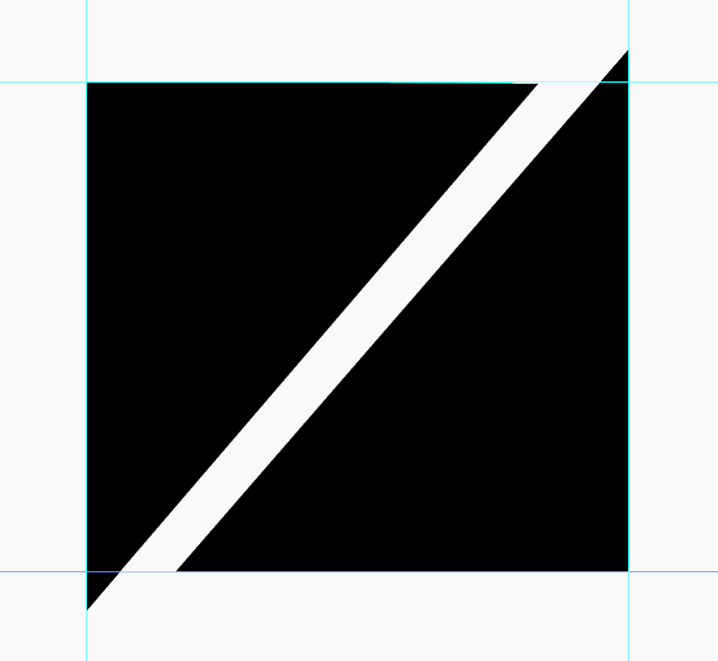
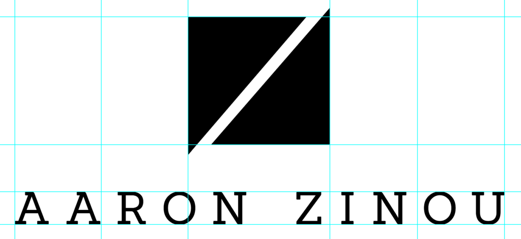
A strong brand symbol: This section embodies his key attributes, such as flexibility, quality, strength, and his initials. The goal was to create a visually impressive brand symbol that reflects these qualities. The chosen shapes are bold, sharp-edged elements that are slightly offset from one another to represent flexibility. At the same time, they form a square, symbolizing stability and strength. The proportions of the brand symbol in relation to the text were deliberately chosen to convey confidence, which in turn expresses the high quality of his service. A particular detail is that the initials “A” and “Z” are only visible on the second or even third glance. This deliberate design trick creates a moment of discovery for viewers, capturing their attention for longer.

The logotype: An essential part of the logo is, of course, the wordmark “Aaron Zinou,” which emphasizes the name as a central element. The font is particularly dominant here, placing the focus on his personality and brand. To highlight Aaron’s professionalism while also maintaining a sense of approachability, I chose a serif typeface. This font conveys a certain authority while remaining human and inviting, which is especially important in the fitness industry, where trust and personal connection are crucial.

The signature “Personal Trainer”: This part may seem somewhat unusual at first glance, but it is particularly important in this case. Since I deliberately avoided using stereotypical fitness symbols like dumbbells or muscular figures in the brand symbol, the additional indication of Aaron’s profession is essential. The “Personal Trainer” signature underscores his expertise and immediately gives viewers a clear understanding of his field without the design falling into clichés. This allows the logo to remain elegant and modern while accurately conveying Aaron’s professional background.

Despite the multitude of elements integrated into the logo, the overall design appears remarkably balanced and harmonious. Each element is perfectly proportioned, allowing the logo to fully represent Aaron’s personality, values, and services. What was particularly pleasing is that the entire design process went smoothly, without many revision cycles. The logo was quickly developed into its final version and delivered to the client to their complete satisfaction.

This detailed and thoughtful approach made it possible to visually capture Aaron’s brand in an authentic and powerful way.

...