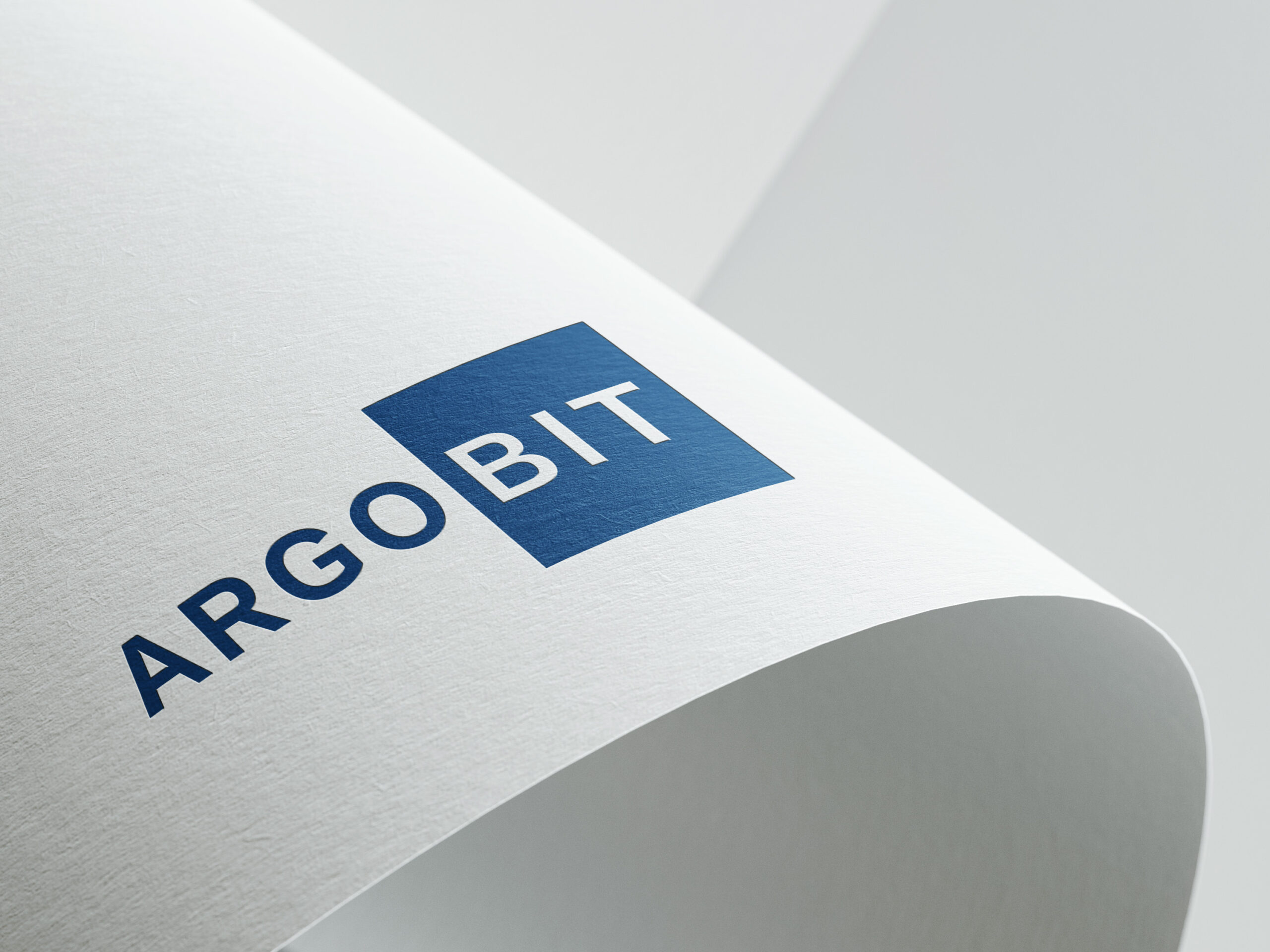
The clean, sans-serif typography represents precision and transparency, qualities that are essential in quality assurance. Every detail appears structured and professional, conveying trust and competence.
The division into two segments – “ARGO” and “BIT” – highlights the connection between reliability (ARGO as a symbol of stability and consistency) and technology (BIT as a reference to digital processes, data, and innovation).
The choice of deep blue conveys seriousness, security, and trust – central values that clients expect from a quality assurance company. Depending on the variation, the design is enhanced by accents such as turquoise or abstract symbols, emphasizing dynamism, forward-thinking, and digital expertise.
Overall, the logo was created to appear modern, memorable, and professional. It communicates a clear message: ARGOBIT stands for tested quality, technological expertise, and absolute reliability.