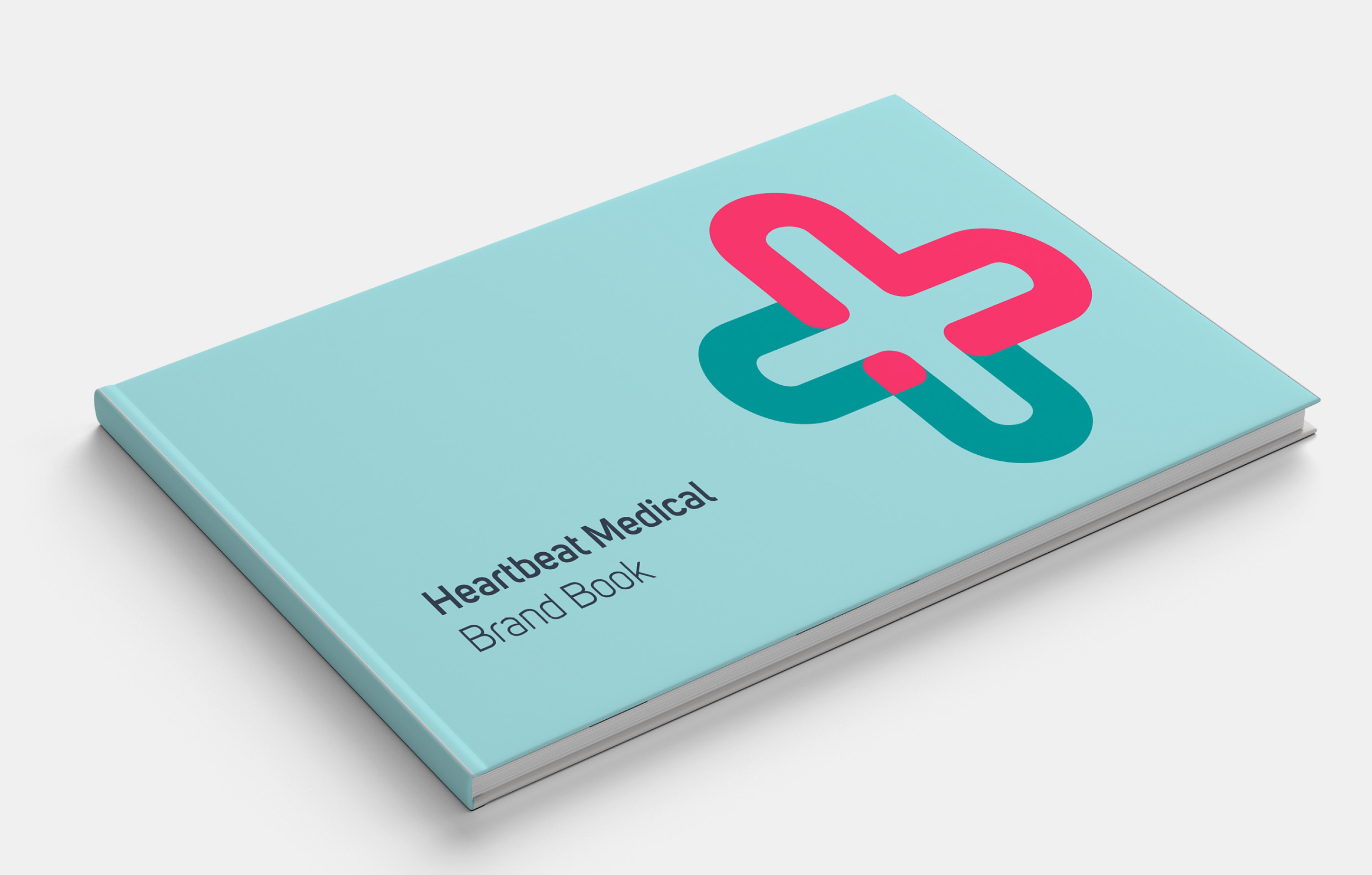
After the rebranding of Heartbeat Medical was finalized on paper, the website was next in line, alongside other channels and materials like social media, presentation templates, one-pagers, and flyers.
The primary focus was on adhering to the established guidelines, with particular emphasis on readability and accessibility, especially concerning contrast, which had been somewhat lacking in the previous design.
This included the removal of the color red, the careful use of new colors, and optimizing the reading flow to avoid triggering unnecessary distractions that would cause the eye to dart erratically across the screen. This overstimulation had been a key factor in the site’s high bounce rate.
